There's something that's bugged me for the entire time I've been using a PC. It concerns a fairly standard UI component that I'm sure you'll be familiar with: the orderable table.
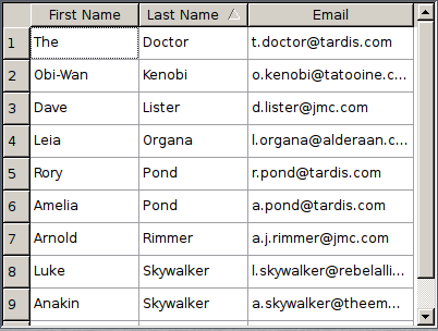
An Orderable Table
As you're probably aware, a table like this usually holds rows of data which can be sorted by any of the table's columns. Clicking on a column header will order the data by that column. Clicking this column again will toggle the order direction between ascending order and descending order. It's a great idea. However, my issue has always been with the icon indicating the order direction.
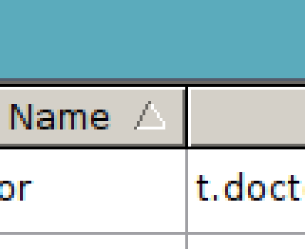
The Order Direction Icon
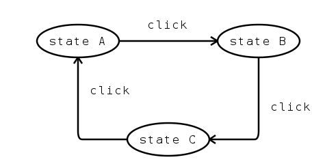
When you have a single button toggling between multiple states such as this, it's especially important that the current state is indicated unambiguously. When there are separate buttons for each state, this is less important. With a set of radio buttons, for example, you can be fairly sure that after clicking, the new state will be the one corresponding to the button you clicked. You're telling the system which state to jump into, directly.
In the state diagram above, clicking "b" has the unambiguous result of entering state "B".
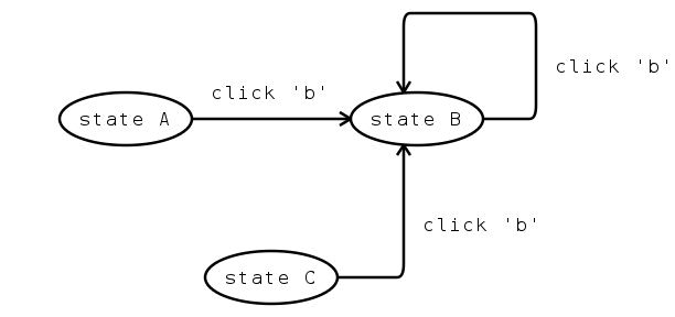
By contrast, clicking a single toggle button is asking the system to cycle from one state to another. To operate this button successfully, the user must understand which state the button is in before clicking. If the toggle has more than two states, the user must understand which state the button is in after clicking, too.
In the state diagram above, a the result of a click is ambiguous. Are we now in state "A", "B" or "C"? Where did we start?
This is the problem. In the case of an orderable table, the order direction icon is essential for reporting the current state of the table, and I've always found this icon to be ambiguous. The icon is simply a filled triangle which is flipped vertically depending on the order direction. Originally, I saw this triangle as an arrow pointing in the direction that the items would flow. In my head, a downwards arrow would mean the items would be ordered from top to bottom. They would start at the top and flow downwards in the direction of the arrow. Of course, this isn't the case, and in my confusion I would usually end up clicking the column header a few times until it was in the correct order.
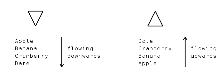
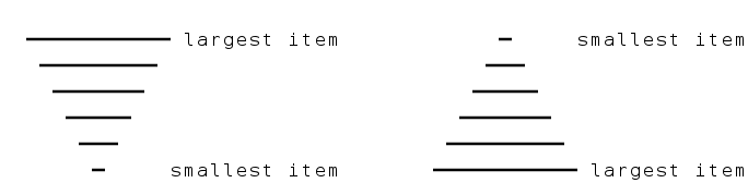
Perhaps the icon instead represents a stacked pyramid. This was my assumption after realising my original mental model was wrong. The downwards arrow could instead be seen as a stack of lines where the widest line was at the top, representing the largest item being at the top, and the thinnest line was at the bottom, representing the smallest item being at the bottom.
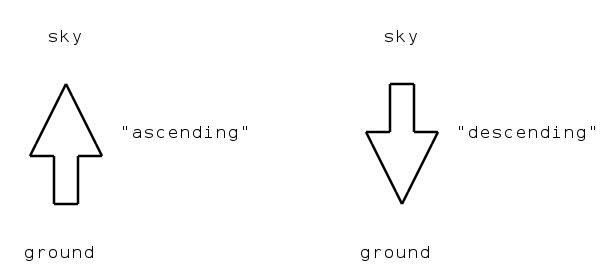
Another way to see the icon is as a representation of "ascending" or "descending" as concepts, irrespective of the resulting direction of flow within the table. The upwards arrow simply represents the concept of ascending - of traveling upwards. Likewise the downwards arrow represents the concept of traveling downwards. This interpretation of the icon would make sense, and in theory the use of an arrow to represent an abstract concept shouldn't cause any more of a usability issue than, say, the use of a leftwards arrow to represent "undo". Perhaps there is a tendency to expect an arrow to be pointing at something, and confusion is caused when there is something that fits with this assumption.
As a final thought: it would appear that the Mozilla developers are as confused by ordered tables as I am. In the latest version of the Mozilla Thunderbird email client, at the time of writing, the order direction icons are oriented the opposite way round from usual. When emails are listed in ascending date order the triangle points downwards, and when descending it points upwards.
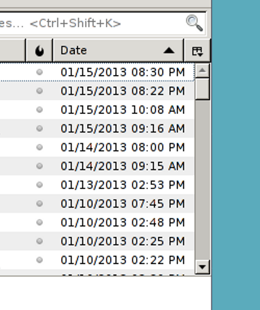
Thunderbird's Reversed Icons
I have no idea whether this was intentional or not. Perhaps Mozilla are trying something different, or maybe it's a simple bug. Either way, it doesn't help my poor bewildered mind.


Comments